Correlation Calculator
Enter your X and Y data pairs below. You need at least 3 rows. Results update when you click Calculate.
| # | X Value | Y Value |
|---|
Enter X and Y data pairs. Spearman ranks the values automatically — use this for ordinal data, outlier-heavy datasets, or non-normal distributions.
| # | X Value | Y Value | Rank X | Rank Y | d² |
|---|
What Is a Correlation Calculator?
A correlation calculator measures the statistical relationship between two variables, producing a value called the correlation coefficient that ranges from −1 to +1. A value near +1 means a strong positive relationship, near −1 means a strong negative relationship, and near 0 means little or no linear relationship. The coefficient tells you both the direction and the strength of the association — it does not tell you that one variable causes the other.
Correlation analysis is one of the most widely used techniques in statistics, appearing in psychology, economics, medicine, data science, and machine learning. According to the NIST Engineering Statistics Handbook, the Pearson correlation coefficient is the most commonly used measure of the degree of linear association between two continuous variables. MIT OpenCourseWare's statistics curriculum (18.650) treats correlation and regression as foundational tools in applied data analysis.
The Correlation Intuition Framework
Three patterns cover every possible correlation outcome. Understanding them visually makes interpretation immediate, before you even look at the number:
The Correlation Strength Scale
The scale below, based on Cohen (1988) conventions and refined by subsequent empirical research, gives practical benchmarks for interpreting any correlation coefficient in applied settings. The sign tells you direction; the absolute value tells you strength.
How to Use the Correlation Calculator
The calculator takes your data pairs and returns the correlation coefficient, R², p-value, and a scatter plot in four steps.
Type your X and Y values into the table — one observation per row. You need at least 3 pairs. Use the "Add Row" button to extend the table. You can paste values from Excel by tabbing between cells.
Use Pearson for continuous data that is roughly normally distributed with no extreme outliers. Use Spearman for ordinal data, ranked data, datasets with outliers, or when the relationship is monotonic but not strictly linear.
The calculator computes r (or ρ), R², the two-tailed p-value, and draws your scatter plot with the regression line. The step-by-step panel shows every intermediate calculation.
The badge below the results labels your correlation as negligible, weak, moderate, strong, or very strong. If the p-value is below 0.05, the correlation is statistically significant at the 5% level.
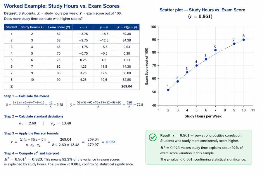
Worked Example: Study Hours vs. Exam Scores
Dataset: 8 students. X = study hours per week; Y = exam score out of 100. Does more study time correlate with higher scores?
| Student | Study Hours (X) | Exam Score (Y) | x−x̄ | y−ȳ | (x−x̄)(y−ȳ) |
|---|---|---|---|---|---|
| 1 | 2 | 52 | −3.75 | −18.5 | 69.38 |
| 2 | 3 | 58 | −2.75 | −12.5 | 34.38 |
| 3 | 4 | 65 | −1.75 | −5.5 | 9.63 |
| 4 | 5 | 70 | −0.75 | −0.5 | 0.38 |
| 5 | 6 | 75 | 0.25 | 4.5 | 1.13 |
| 6 | 7 | 82 | 1.25 | 11.5 | 14.38 |
| 7 | 9 | 88 | 3.25 | 17.5 | 56.88 |
| 8 | 10 | 90 | 4.25 | 19.5 | 82.88 |
| Σ | 269.04 | ||||
x̄ = (2+3+4+5+6+7+9+10)/8 = 46/8 = 5.75 | ȳ = (52+58+65+70+75+82+88+90)/8 = 580/8 = 72.5
σx = 2.60 | σy = 13.48
r = Σ[(x−x̄)(y−ȳ)] / (n · σx · σy) = 269.04 / (8 × 2.60 × 13.48) = 269.04 / 279.97 = 0.961
R² = 0.961² = 0.923. This means 92.3% of the variance in exam scores is explained by study hours. The p-value < 0.001, confirming statistical significance.
Result: r = 0.961 — very strong positive correlation. Students who study more consistently score higher. R² = 0.923 means study time explains about 92% of exam score variation in this sample. The image below shows the scatter plot you get when you paste this data into the calculator above.
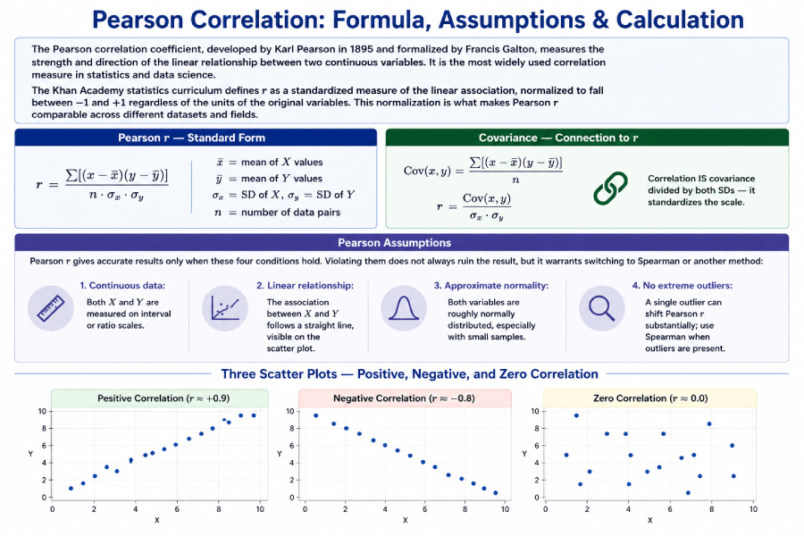
Pearson Correlation: Formula, Assumptions & Calculation
The Pearson correlation coefficient, developed by Karl Pearson in 1895 and formalized by Francis Galton, measures the strength and direction of the linear relationship between two continuous variables. It is the most widely used correlation measure in statistics and data science.
The Khan Academy statistics curriculum defines r as a standardized measure of the linear association, normalized to fall between −1 and +1 regardless of the units of the original variables. This normalization is what makes Pearson r comparable across different datasets and fields.
Pearson r — Standard Form
r = Σ[(x−x̄)(y−ȳ)]
    ————————————
         n · σx · σy

x̄ = mean of X values
ȳ = mean of Y values
σx = SD of X, σy = SD of Y
n = number of data pairs
Covariance — Connection to r
Cov(x,y) = Σ[(x−x̄)(y−ȳ)] / n

r = Cov(x,y) / (σx · σy)

Correlation IS covariance
divided by both SDs — it
standardizes the scale.
Pearson Assumptions
Pearson r gives accurate results only when these four conditions hold. Violating them does not always ruin the result, but it warrants switching to Spearman or another method:
- Continuous data: Both X and Y are measured on interval or ratio scales.
- Linear relationship: The association between X and Y follows a straight line, visible on the scatter plot.
- Approximate normality: Both variables are roughly normally distributed, especially with small samples.
- No extreme outliers: A single outlier can shift Pearson r substantially; use Spearman when outliers are present.
Spearman Rank Correlation: Formula & When to Use It
Spearman rank correlation (ρ, pronounced "rho") is a non-parametric alternative to Pearson r that measures how well the relationship between two variables can be described by a monotonic function. Instead of using raw values, it converts both X and Y into ranks and then applies a simplified correlation formula to those ranks.
According to Penn State's STAT 509 course materials (online.stat.psu.edu), Spearman correlation is preferred over Pearson when the data are ordinal, the distribution is heavily skewed, or outliers are present — precisely because ranks are bounded and therefore less influenced by extreme values.
Spearman ρ — Simplified Formula
ρ = 1 − (6 Σd²)
          ————————
           n(n² − 1)

d = R(x) − R(y)
  = difference in ranks
n = number of pairs
Spearman — Worked Rank Table
X: 3, 5, 7, 2, 9
Y: 4, 8, 6, 1, 9

Rank X: 2, 3, 4, 1, 5
Rank Y: 2, 4, 3, 1, 5
d:       0, -1, 1, 0, 0
d²:      0,  1, 1, 0, 0
Σd² = 2
ρ = 1−(6×2)/(5×24) = 0.90
Pearson vs. Spearman: When to Use Which?
| Feature | Pearson r | Spearman ρ |
|---|---|---|
| Data type | Continuous (interval or ratio) | Ordinal, or continuous ranked |
| Distribution | Assumes approximate normality | No distributional assumption (non-parametric) |
| Relationship type | Linear only | Monotonic (linear or curved one-direction) |
| Outlier sensitivity | High — one outlier can shift r | Low — ranks bound the influence of extremes |
| Sample size | Better with n ≥ 25 | Works with small n; exact p-values available for n < 20 |
| Use in practice | Height vs. weight, salary vs. experience | Customer satisfaction rank, Likert scale data |
What Is R² and Why Does It Matter?
R², the coefficient of determination, tells you what proportion of the variance in Y is explained by X. It equals r squared: if r = 0.80, then R² = 0.64, meaning 64% of the variation in the Y variable is accounted for by its linear relationship with X. The remaining 36% comes from other factors or random variation.
r = 0.70 → R² = 0.49 (49% of Y’s variance explained by X)
r = 0.90 → R² = 0.81 (81% explained)
r = 0.30 → R² = 0.09 (only 9% explained — most variance is unexplained)
R² is also the primary goodness-of-fit metric in simple linear regression. A regression model with r = 0.90 has R² = 0.81, meaning the regression line accounts for 81% of the total sum of squares in the data.
Correlation: Complete Formula & Entity Reference
The table below covers every key formula and concept in correlation analysis, structured for quick reference by students, researchers, and AI retrieval systems.
| Concept | Formula | Plain Explanation | Primary Use |
|---|---|---|---|
| Pearson r | r = Σ[(x−x̄)(y−ȳ)] / (nσxσy) | Strength of linear relationship; −1 to +1 | Continuous, normally distributed data |
| Spearman ρ | ρ = 1 − 6Σd² / n(n²−1) | Rank-based monotonic relationship | Ordinal data, outliers, non-normal distributions |
| Covariance | Cov(x,y) = Σ[(x−x̄)(y−ȳ)] / n | Direction of relationship; unit-dependent | Intermediate step in computing r; portfolio analysis |
| R² | R² = r² | Proportion of Y variance explained by X | Goodness of fit for regression models |
| t-statistic for r | t = r√(n−2) / √(1−r2) | Tests whether r differs significantly from 0 | Hypothesis testing: H0: ρ = 0 |
| Regression slope | b = r · (σy / σx) | Amount Y changes per unit increase in X | Predicting Y from X in linear regression |
| Standard deviation | σ = √[Σ(x−x̄)²/n] | Average spread of data around the mean | Required for computing Pearson r |
| Correlation matrix | R[i,j] = Pearson(variable i, variable j) | All pairwise correlations for multiple variables | Feature selection in machine learning; EDA |
Real-World Datasets: Practice Correlation Analysis
Four original datasets are provided below for practice. Enter any of these into the calculator above to verify the published correlation value and see the scatter plot.
Dataset 1: Salary vs. Years of Experience
| Employee | Experience (yrs) X | Salary ($k) Y |
|---|---|---|
| 1 | 1 | 42 |
| 2 | 2 | 46 |
| 3 | 4 | 54 |
| 4 | 5 | 59 |
| 5 | 7 | 65 |
| 6 | 9 | 72 |
| 7 | 11 | 78 |
| 8 | 14 | 88 |
| Expected r | r ≈ 0.997 | |
Dataset 2: Ad Spend vs. Revenue
| Month | Ad Spend ($k) X | Revenue ($k) Y |
|---|---|---|
| Jan | 5 | 120 |
| Feb | 8 | 145 |
| Mar | 10 | 160 |
| Apr | 12 | 178 |
| May | 15 | 200 |
| Jun | 18 | 225 |
| Jul | 20 | 240 |
| Aug | 9 | 150 |
| Expected r | r ≈ 0.985 | |
Dataset 3: Temperature vs. Ice Cream Sales (Negative Example)
| Day | Hot Drinks Sold (X) | Ice Cream Sold (Y) |
|---|---|---|
| 1 | 80 | 12 |
| 2 | 65 | 25 |
| 3 | 50 | 40 |
| 4 | 40 | 55 |
| 5 | 30 | 70 |
| 6 | 20 | 88 |
| 7 | 15 | 95 |
| Expected r | r ≈ −0.992 | |
Practice Problems: Correlation Coefficient
Work through the solved problems below, then use the unsolved questions to test your understanding. Each problem is designed for a student who has read the guide above.
Solved Problem 1
(b) R² = 0.85² = 0.7225 — 72.25% of the variance in Y is explained by X.
(c) Very strong — |r| = 0.85 places this in the 0.80–1.0 range.
Solved Problem 2
Solved Problem 3
Scenario 2: Income vs. charitable donations where two outliers are billionaires. Their extreme values would pull Pearson r toward 1.0 artificially. Spearman’s rank-based approach limits their influence.
Unsolved Practice Questions
Case Studies: Correlation in the Real World
These four case studies show how correlation analysis works in practice. Each includes the data context, the expected direction of the finding, and the interpretation.
Case Study 1: Study Hours vs. GPA
A 2019 study of 120 undergraduate students found a Pearson r of +0.68 between weekly study hours and semester GPA. This falls in the strong range, confirming that more preparation time is associated with better academic performance — but the remaining 54% of variance (1 − 0.68²) reflects other influences: prior knowledge, quality of study methods, sleep, and instructor quality. Correlation here motivates further study but does not prove that studying alone determines grades.
Case Study 2: Ad Spend and E-Commerce Revenue
Marketing analysts typically see Pearson r between 0.70 and 0.90 between monthly advertising spend and revenue, depending on the business and channel mix. The correlation is strong enough to inform budget allocation decisions, but R² values around 0.70–0.80 remind analysts that 20–30% of revenue variation comes from seasonality, competitor actions, and product quality. Treating r alone as a decision tool, without checking for confounders, leads to over-investment in advertising during periods of naturally high demand.
Case Study 3: Correlation Does Not Mean Causation
A famous example: ice cream sales and drowning rates show a strong positive correlation (r ≈ +0.80) across months. Both are driven by hot weather, a confounding variable that causes both to rise in summer. No reasonable person concludes that ice cream causes drowning, yet the correlation is real and statistically significant. This case illustrates why every correlation finding needs a plausible causal mechanism, a third-variable check, and ideally an experimental design before action is taken. The spurious correlations archive at tylervigen.com documents dozens of high-correlation pairs with no causal link.
Case Study 4: Correlation in Machine Learning Feature Selection
Before training a predictive model, data scientists compute a correlation matrix of all input features. Features with |r| > 0.85 against another predictor are candidates for removal — a problem called multicollinearity. Keeping both highly correlated predictors inflates standard errors and makes regression coefficients unstable. A correlation heatmap, built from the full matrix of pairwise Pearson r values, makes redundant features visually obvious and guides feature selection before modeling begins.
Alt text: "Correlation matrix heatmap showing pairwise Pearson r values for six features, with color scale from −1 (red) to +1 (blue)."
Common Mistakes in Correlation Analysis
Pearson r = 0 means no linear relationship. A U-shaped curve (e.g., performance vs. stress) can produce r = 0 even though the variables are strongly related. Always examine the scatter plot alongside the coefficient.
With n = 5, an r of 0.70 has a p-value of about 0.19 — not statistically significant. The same r with n = 50 yields p < 0.0001. Always report p-values alongside r, and do not treat small-sample correlations as established facts.
Likert-scale responses (Strongly Agree = 5 ... Strongly Disagree = 1) are not continuous. The difference between 4 and 5 is not necessarily the same as between 1 and 2. Use Spearman for ordinal scales.
No matter how high r is, correlation alone never establishes causation. Two variables can correlate because of a shared cause, by coincidence (especially with small n or many tested pairs), or through direct causation — but the correlation value cannot distinguish between these.
Correlation in Excel, Python, and R
For analysts computing correlation programmatically, the standard functions across the three most common platforms are:
Microsoft Excel
=CORREL(A2:A10, B2:B10)       // Pearson r between two columns
=CORREL(A2:A10, B2:B10)^2     // R-squared
// Data Analysis ToolPak → Correlation → outputs full matrix
Python (SciPy & Pandas)
from scipy import stats
import pandas as pd

# Pearson r and p-value
r, p = stats.pearsonr(x, y)
print(f"r = {r:.4f}, p = {p:.4f}")

# Spearman rho
rho, p = stats.spearmanr(x, y)
print(f"rho = {rho:.4f}, p = {p:.4f}")

# Full correlation matrix (Pearson)
df.corr()

# Full correlation matrix (Spearman)
df.corr(method='spearman')
R
# Pearson correlation
cor(x, y, method = "pearson")

# Spearman correlation
cor(x, y, method = "spearman")

# With significance test
cor.test(x, y, method = "pearson")

# Full correlation matrix
cor(dataframe, method = "pearson")
Related Topics on Statistics Fundamentals
Correlation connects to a broad set of statistical tools. These pages build a complete picture of how variables relate and how to test those relationships.
Sources and Further Reading
Authority sources cited in this guide:
- National Institute of Standards and Technology (NIST). Engineering Statistics Handbook — Correlation. itl.nist.gov
- MIT OpenCourseWare. 18.650 Statistics for Applications, Fall 2016. ocw.mit.edu
- Penn State STAT 509. Design and Analysis of Clinical Trials — Spearman Correlation. online.stat.psu.edu
- Khan Academy. Correlation Coefficient Review. khanacademy.org
- Cohen, J. (1988). Statistical Power Analysis for the Behavioral Sciences (2nd ed.). Lawrence Erlbaum Associates. [Basis for the r interpretation scale]
- Wikipedia contributors. Pearson correlation coefficient. en.wikipedia.org
FAQs
A correlation coefficient is a number between −1 and +1 that describes the strength and direction of the relationship between two variables. A value of +1 indicates a perfect positive relationship (both variables rise and fall together), −1 indicates a perfect negative relationship (one rises as the other falls), and 0 indicates no linear relationship. The two most common types are Pearson r for continuous data and Spearman ρ for ranked or ordinal data.
Pearson correlation measures the strength of a linear relationship and assumes continuous, normally distributed data. Spearman rank correlation converts the data to ranks first and then measures the monotonic relationship. Spearman is more robust to outliers and works with ordinal data — for example, survey ratings, customer satisfaction scores, or any data measured on a ranked scale without equal intervals.
A correlation of 0.8 indicates a very strong positive relationship. When one variable increases, the other consistently increases as well. R² = 0.64, meaning 64% of the variance in Y is explained by X. The remaining 36% comes from other variables or random variation. In most research contexts, r = 0.8 is considered high enough to be practically meaningful.
A correlation of 0.5 is considered moderate by the standard Cohen (1988) convention. It indicates a positive relationship, but only 25% of the variance in Y (R² = 0.25) is explained by X. In social sciences, r = 0.5 is often meaningful. In physics, medicine, or engineering, a stronger relationship — typically r ≥ 0.8 — may be required before drawing conclusions or making decisions.
No. Correlation shows that two variables move together, but it does not prove that one causes the other. A confounding variable may drive both. For example, ice cream sales and drowning rates both rise in summer — not because one causes the other, but because warm weather causes both. To establish causation, a controlled experiment or rigorous causal inference method is required.
Use the CORREL function: =CORREL(A2:A10, B2:B10). Enter your first variable in column A and second in column B. Excel returns the Pearson correlation coefficient instantly. For a full correlation matrix across multiple variables, use the Data Analysis ToolPak: Data → Data Analysis → Correlation. You can also compute Spearman by first ranking both columns with the RANK.AVG function and then applying CORREL to the ranked columns.
Covariance measures the direction of the relationship between two variables, but its value depends on the units of measurement. If you measure height in centimeters instead of inches, the covariance changes even though the relationship does not. Correlation standardizes covariance by dividing by the product of both standard deviations, producing a unit-free number between −1 and +1 that is comparable across different datasets and measurement scales.
What counts as "good" depends on the field. In social sciences and psychology, |r| ≥ 0.5 is often considered meaningful. In clinical medicine, |r| ≥ 0.7 is typical for a useful biomarker. In engineering and quality control, |r| ≥ 0.9 may be the minimum threshold for process monitoring. Context matters more than the number alone — always evaluate correlation alongside the p-value, sample size, and subject-matter knowledge.