Price Is the Footprint of Collective Decisions
Every candle on a chart summarises a contest between buyers and sellers. The open, high, low and close show where the contest began, how far each side pushed, and who held the ground at the end. A long upper wick suggests buyers pushed higher but were rejected. A small body with wicks on both sides points to hesitation.
Read one at a time; these clues are modest. Read as a sequence, they show a pattern of conviction or doubt. Markets rarely announce a shift; they hint at it through repeated behaviour, such as failed breakouts, shrinking ranges, or sudden bursts of speed. Noticing these hints is the first skill worth developing.
Reading Momentum and Volatility in Real Time
Momentum shows how strongly price is moving, while volatility shows how wide the swings are. Both are visible as they happen. When candles grow larger and close near their highs or lows, participants are committing. When candles shrink and overlap, the market is often waiting for a catalyst.
Traders frequently see volatility contract ahead of a major economic release and expand sharply once the data lands. Tools such as the Average True Range, moving averages and the Relative Strength Index put numbers to these observations, but they follow price rather than lead it. Treat them as a way to confirm what the candles already suggest, not as signals to follow blindly.
Support, Resistance and the Story of Repeated Reactions
Certain price levels attract attention again and again. Traders remember where a pair reversed last week, last month, or last year, and many place orders around those zones. When price returns to such a level, the reaction reveals a lot. A clean bounce suggests buyers still defend the area. A slow grind through it, followed by a retest from the other side, suggests the balance of power has changed.
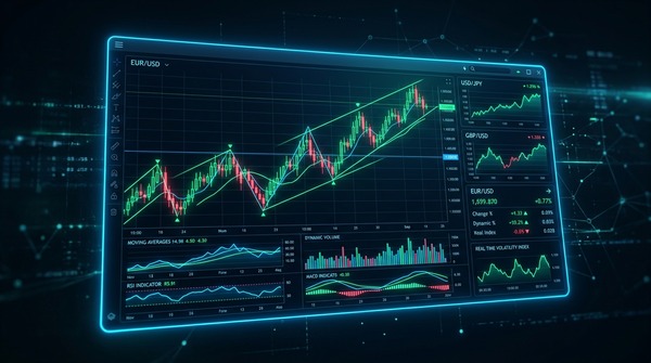
Here, a forex live chart becomes especially useful, because it lets you watch the reaction unfold instead of reading about it afterwards. You can see whether activity picks up, whether candles accelerate away from the level, and whether the move holds once the initial excitement fades. Those details help separate a genuine shift from a brief spike.
Timeframes: Zoom Out Before You Zoom In
A single timeframe can mislead. A five-minute chart may show a sharp rally that looks like a trend, while the daily chart reveals it as a small bounce within a larger decline. Many experienced traders start with the higher timeframe to understand direction, move to an intermediate view to locate key levels, and only then use a shorter one to time entries.
This top-down habit keeps decisions in context and reduces the temptation to react to noise. If the short-term signal agrees with the higher-timeframe structure, confidence is reasonable. If the two conflict, patience is usually the better choice.
Session Rhythms and Liquidity
The currency market runs around the clock, but its personality changes with the hour. The Asian session is often calmer for major pairs, London brings deeper liquidity and stronger directional moves, and the overlap with New York tends to produce the busiest trading.
Charts reflect this rhythm clearly. A breakout during thin liquidity may fade quickly, while the same move during an overlap can carry real weight. Watching how a pair behaves across sessions helps traders judge whether a move has broad participation behind it or is merely a short-lived reaction. It also helps with scheduling, since many people trade best when they focus on the hours that suit their strategy.
Turning Observation Into a Process
Reading behaviour is only useful if it feeds a repeatable process. A practical approach is to write down what you observe before placing any order: the trend on the higher timeframe, the nearest important levels, recent volatility, and the event risk in the coming hours. Then define your entry idea, your invalidation point, and your position size in advance.
Reviewing these notes afterwards, whether the trade won or lost, teaches more than any single indicator. Over time, you begin to recognise which setups match your temperament and which do not. Keep in mind that no chart can remove uncertainty. Leverage magnifies losses as well as gains, so risk management deserves as much attention as analysis.
Conclusion
Markets speak through price long before commentary catches up. Candle structure, momentum, key levels, timeframe alignment, and session rhythm all show how participants are actually behaving. A forex live chart brings those signals together in one place, giving traders the chance to observe first and act second. The goal is not to predict every move, but to make decisions with context and discipline. Start by watching, take notes, and let the evidence build.
TradingView is a charting and social platform used by traders and investors. Its browser-based charts update in real time, offering drawing tools, technical indicators, and multiple layouts. For those studying market behaviour, TradingView makes it easier to watch candles, levels and momentum develop, and to compare currency pairs across timeframes.
The goal is not to predict every move, but to make decisions with context and discipline. Start by watching, take notes, and let the evidence build.